
The problem
Agents needed to reach key tools quickly, but the existing global navigation made that difficult. The hierarchy reflected how the organization categorized tools more than how agents worked, and the problem was amplified on mobile, which agents relied on heavily for daily tasks. The result was added searching, frustration, and a risk to productivity.
The inherited navigation
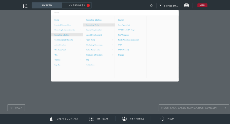
The earlier menu exposed a dense, multi-column hierarchy. This screenshot shows the starting point for the navigation work described below.
The method
The project combined interviews and surveys with WFG agents, concept development, prototyping, and usability testing across desktop and mobile. The work focused on simplifying the navigation, bringing frequently used tools forward, and making the structure easier to use on a small screen.
Steps:
- Research — Interviews and surveys surfaced where the cluttered navigation was costing agents time, especially on mobile.
- Design & prototyping — Developed several concepts that simplified the navigation and reordered tools by frequency of use rather than org-chart structure.
- Usability testing — Tested prototypes with agents and iterated on the desktop and mobile experience based on real-world feedback.
- Implementation — Rolled out the finalized design and monitored user feedback for further refinement.
Tradeoffs: Reordering by frequency of use meant deprioritizing rarely used tools — a deliberate tradeoff that made those destinations require an extra click. It also changed a familiar mental model, so a navigation that tested better still required a deliberate rollout and room for users to adapt. The finalized design was implemented while user feedback continued to inform refinement.
From needs to interface concepts
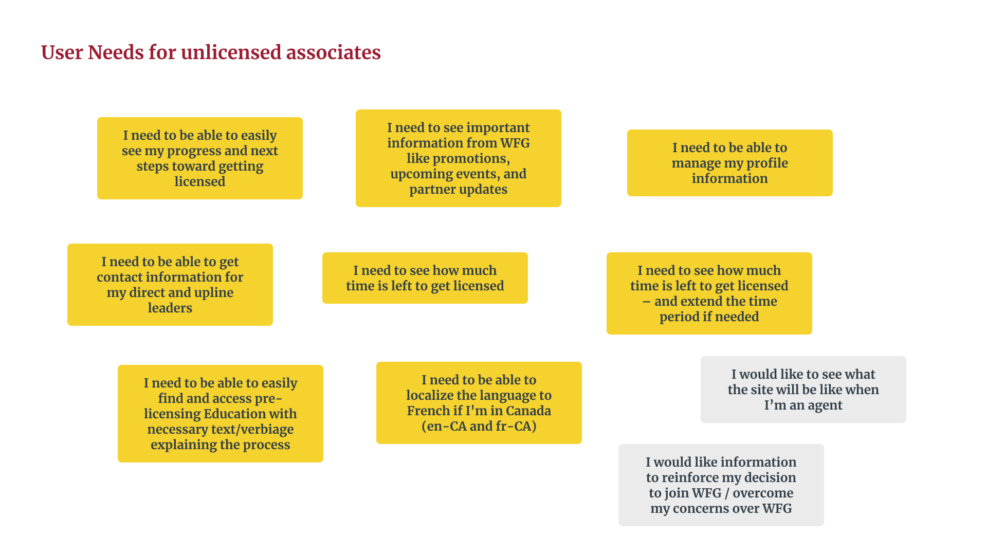
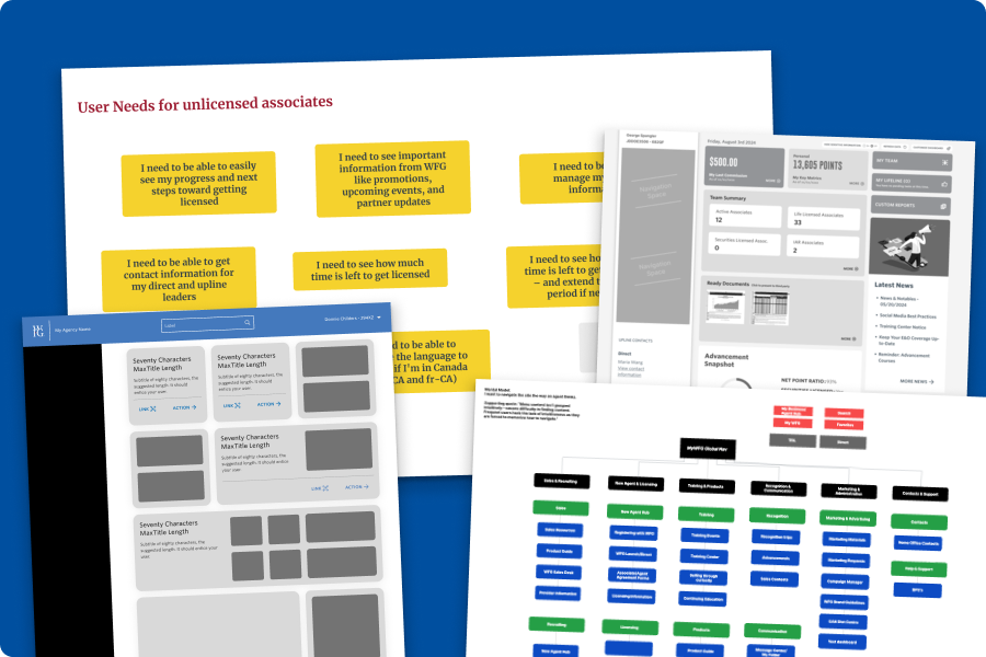
These materials show the broader WFG portal exploration. The needs board focuses on unlicensed associates; the navigation testing described here involved licensed agents.
Key design decision
Research revealed: agents did not primarily describe the navigation in organizational terms. Their feedback pointed toward the work they were trying to do and the tools they used most often; mobile made the cost of a cluttered hierarchy more visible.
Design hypothesis: a simpler hierarchy organized around frequency of use and user mental models would make common destinations easier to find, while keeping less-used tools available deeper in the structure.
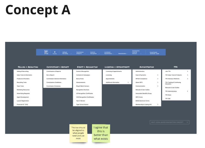
What changed: I cut links and moved frequently used tools forward instead of preserving the existing org-chart ordering. The same principle shaped the mobile experience, where reducing clutter and unnecessary scanning mattered most. The previous-menu screenshot, concept comparison, and later sidebar examples below make that structural shift visible.
Why this direction: in testing, the direction that felt more aligned to how agents saw their business was preferred over a competing concept. That alignment mattered more than simply making the menu look cleaner.
Concept A vs. Concept B
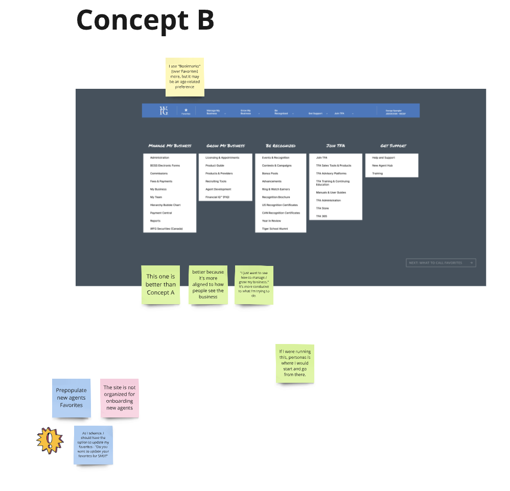
I put two navigation structures in front of agents during qualitative prototype testing. Concept A grouped tools by business function; Concept B used task-oriented labels such as Manage My Business and Grow My Business. The feedback favored Concept B as a closer match to how agents described their work. This was a prototype comparison, not a randomized live-site experiment. Open each image to read the notes at full size.
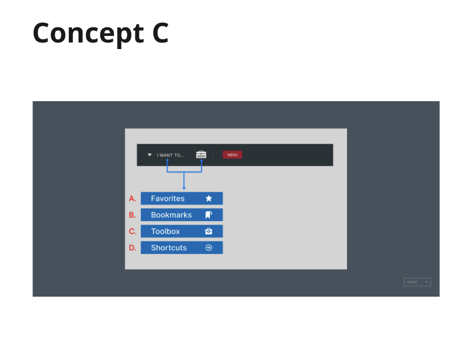
What should saved destinations be called?
Concept C explores labels for shortcuts to frequently used tools. It was a separate language question, not a third variant in the A/B structure comparison.
Applying the navigation
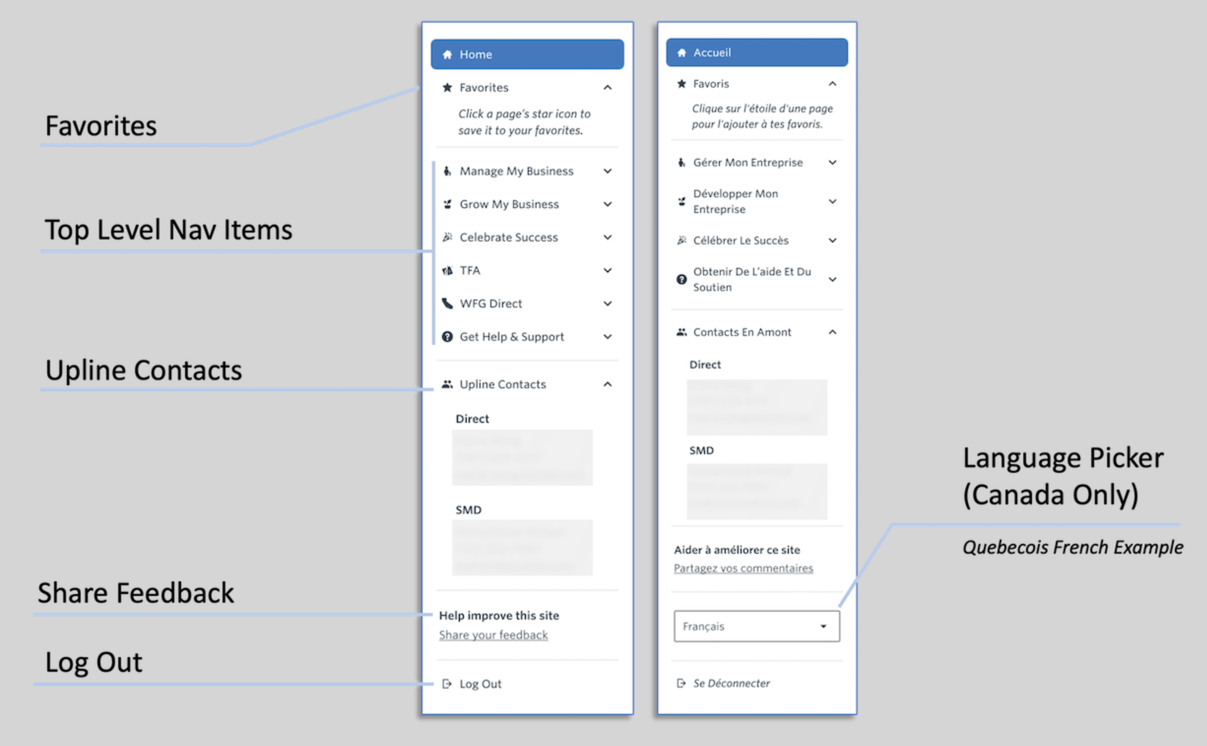
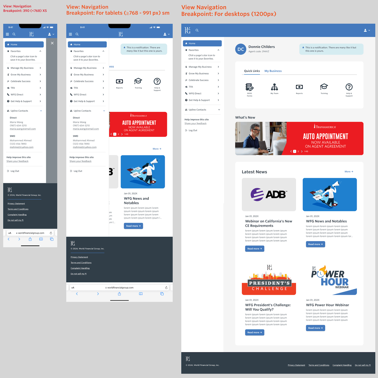
The sidebar detail shows the task-oriented top-level groups alongside Favorites, upline contacts, feedback, and log out. It also includes an English and a Québécois French example, with a language picker shown for Canada. The responsive study shows the navigation in phone, tablet, and desktop contexts. These are interface artifacts; they do not by themselves establish a measured improvement after rollout.
Task labels across languages and screens
The annotated sidebar shows the English and Québécois French examples, including the Canada-only language picker. The second image shows how the navigation fits the portal at phone, tablet, and desktop widths. Open either to inspect it full size.
What the research surfaced
This case study reports ahead of full-rollout data. The goals set from the outset — a notable increase in task completion, higher agent engagement, improved satisfaction, and optimized mobile usage — were research-backed targets, not measured outcomes, and this case study does not claim otherwise.
Usability testing produced directional, qualitative evidence: agents described the simplified layout as easier to navigate and easier to teach to new recruits; mobile optimization was consistently called out as valuable, reinforcing that mobile needed to be treated as a primary use case rather than a compressed desktop experience; the preferred direction was seen as more aligned with how agents understood their business and the work they were trying to do; and change management mattered — some agents initially preferred the familiar layout and anticipated a negative reaction to change before adapting to the new one.
Quotes:
"I feel this is friendlier. This one would be easier to teach my recruits."
"This one is better than Concept A... better because it's more aligned to how people see the business. I just want to see how to manage / grow my business. It's more conducive to what I'm trying to do."
"I like the other one better. People will have negative reaction to change."
Lessons
- Frequency of use beats org-chart structure. Reordering navigation around how often agents used a tool, rather than how the organization categorized it, better matched the way agents described their work.
- Mobile is a primary use case. Agents relied heavily on mobile, and the clearest value of simplification appeared where the clutter hurt most. Mobile should be designed as a first-class surface, not treated only as a scaled-down desktop view.
- Change management is part of the design. Even a redesign that tests better can require a deliberate rollout before users embrace a changed navigation pattern.
Related journey and site-map artifacts
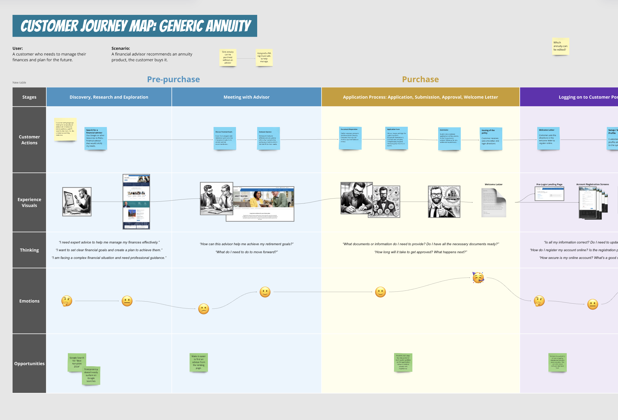
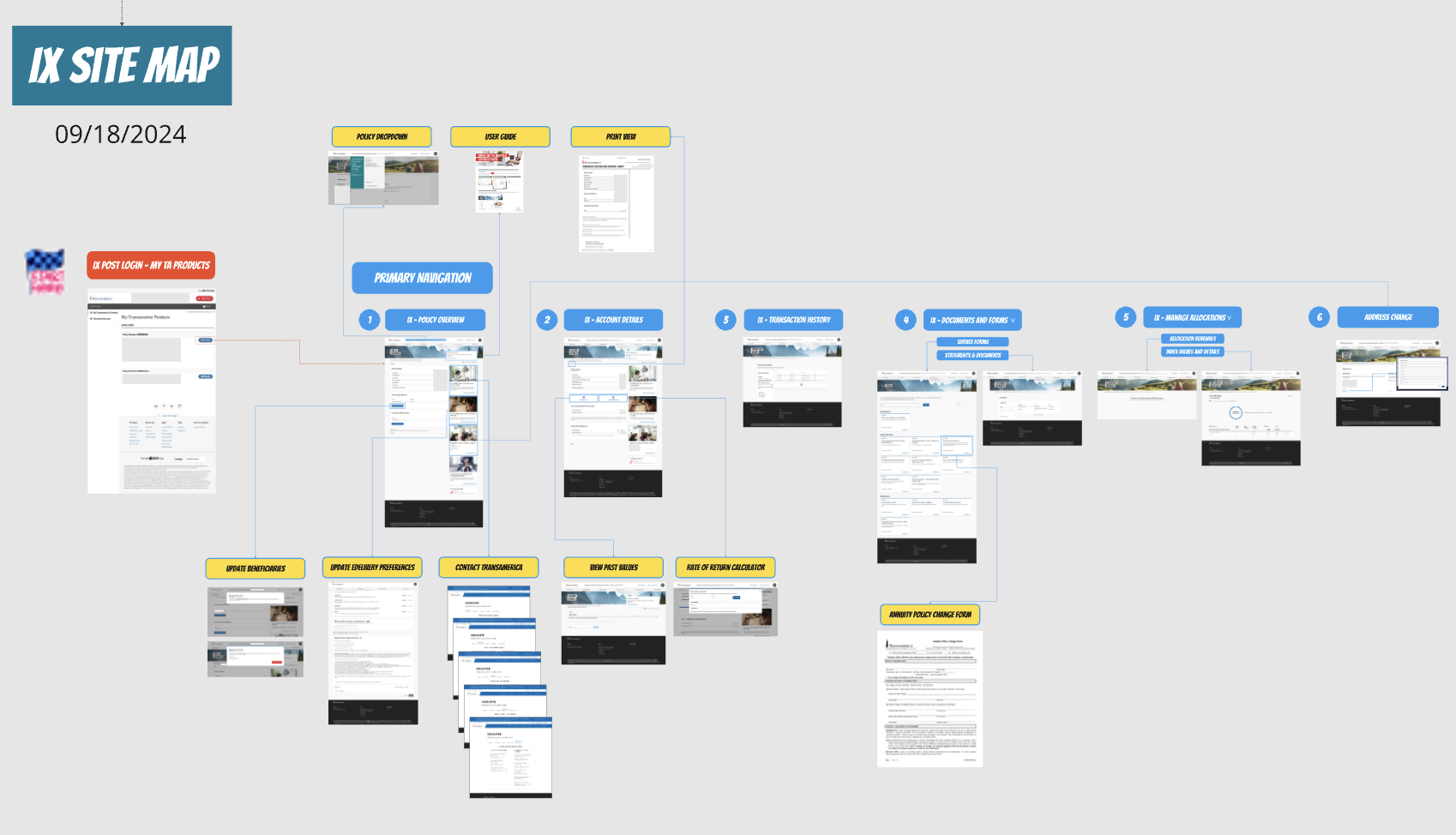
These Transamerica artifacts show adjacent journey-mapping and information architecture work. They are shown for context, not as evidence of the WFG navigation test outcome.
FAQ
Did the redesign improve task completion and engagement? Full-rollout metrics were not measured, so this case study does not claim a verified result. Usability testing produced qualitative evidence: agents described the simplified layout as easier to use and teach, and mobile optimization was consistently flagged as valuable. The completion-rate and engagement figures were goals, not reported outcomes.
How is this different from the WFG Agent Portal case study? That project covered the portal's homepage and role-based dashboards. This one is scoped specifically to the global navigation — the menu structure agents used to get to every tool in the portal, redesigned around frequency of use rather than org-chart categories.