
The problem
The WFG agent portal was unintuitive and inefficient, with essential tools hard to find and no personalization — licensed agents and senior agents saw the same undifferentiated dashboard regardless of what their role actually needed day to day. The result was frustration, reduced productivity, and low engagement with a tool agents were supposed to rely on.
My contribution: I joined after the redesign direction had been set. I pushed for user interviews and usability testing, translated the findings into role-based personalization, and created the custom design system used to carry that direction consistently across the portal.
Process
The project's direction — and the decision to redesign the portal — was set before I joined. Working inside a SAFe Agile team, we identified the opportunity to ground that redesign in actual research rather than carried-over assumptions: user interviews, surveys, and usability testing on wireframes and high-fidelity prototypes, iterated on the feedback they surfaced.
Steps:
- Research — Gathered insights from user interviews, surveys, and usability tests to identify where the single undifferentiated dashboard was obscuring the tools agents needed most.
- Prototyping — Created and tested wireframes and high-fidelity prototypes against the pain points research surfaced.
- Iteration — Refined designs based on feedback to improve usability and functionality before the design was finalized.
- Customization — Built an ad-hoc, unique design system tailored to WFG's branding and functional requirements to ensure consistency and scalability across the platform.
Tradeoffs: The redesign leaned on role-based personalization — licensed agents got quick access to sales tools, senior agents got team-metrics oversight — which meant building a custom design system rather than reusing an existing component set, since WFG's branding and functional requirements did not map cleanly onto off-the-shelf patterns.
Agent-home explorations
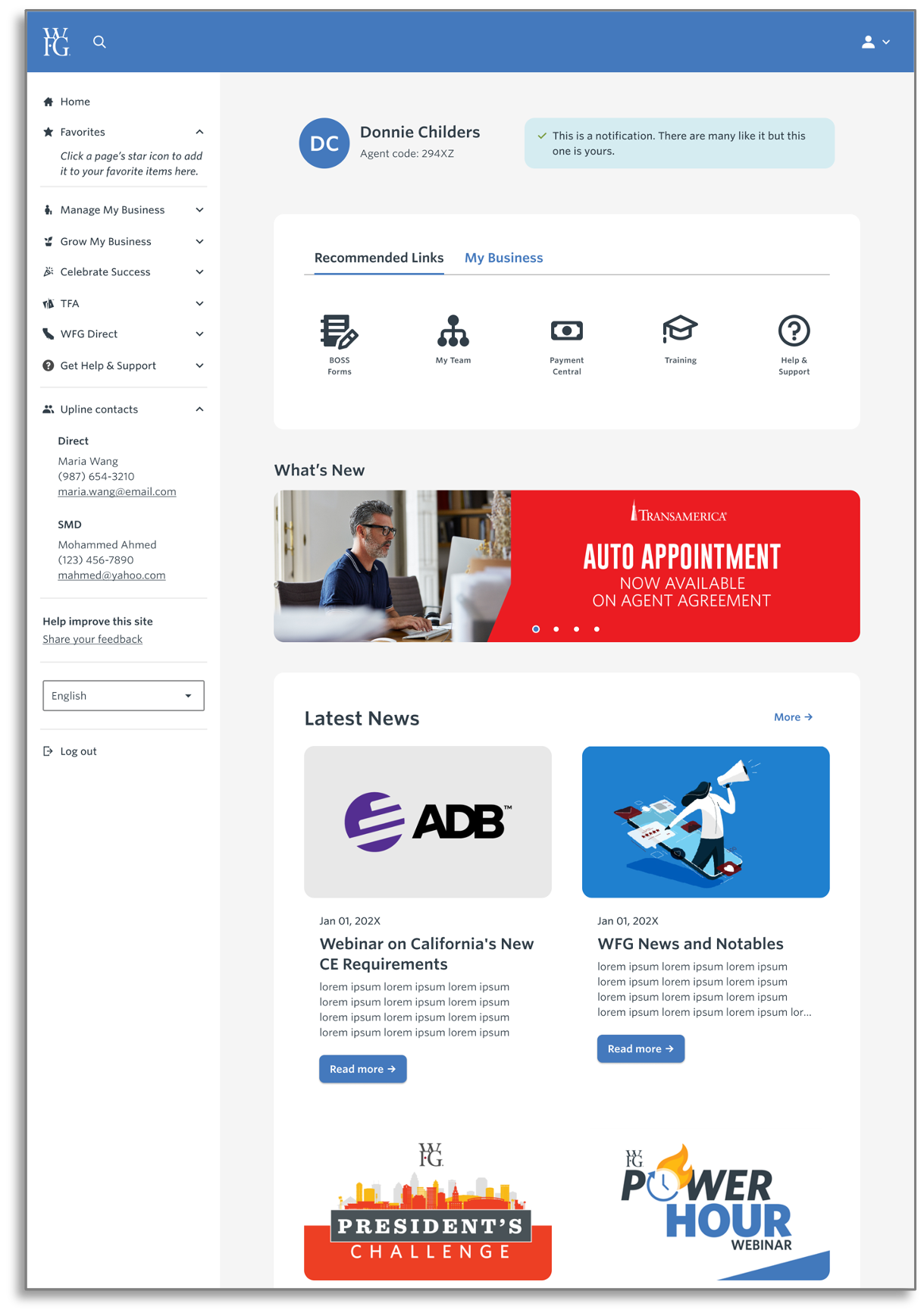
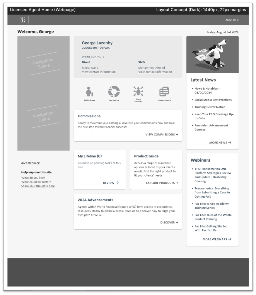
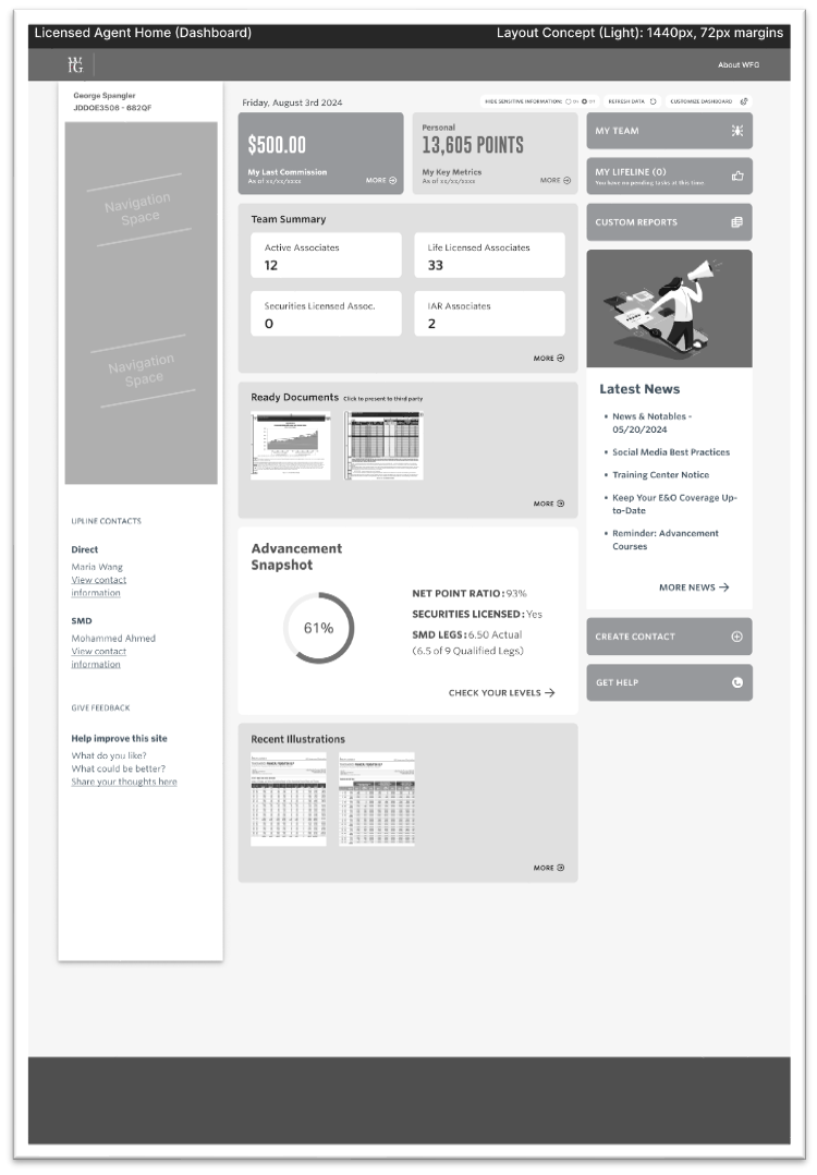
The two grayscale mockups explore a structural choice for the licensed-agent home. Concept 1 works like a webpage, balancing a welcome area, business shortcuts, commissions, and editorial content. Concept 2 is a denser dashboard, putting metrics, team information, and ready documents closer to the top. The polished wireframe shown above develops the agent home with clearer navigation, recommended links, profile context, and news.
These images show how the interface was explored and refined. They do not establish that one layout improved task completion or engagement after launch.
Two ways to organize the agent home
The grayscale mockups explore a webpage-style home and a data-heavy dashboard. They document design directions, not measured outcomes. Open each image to inspect the layout at full size.
The working design system
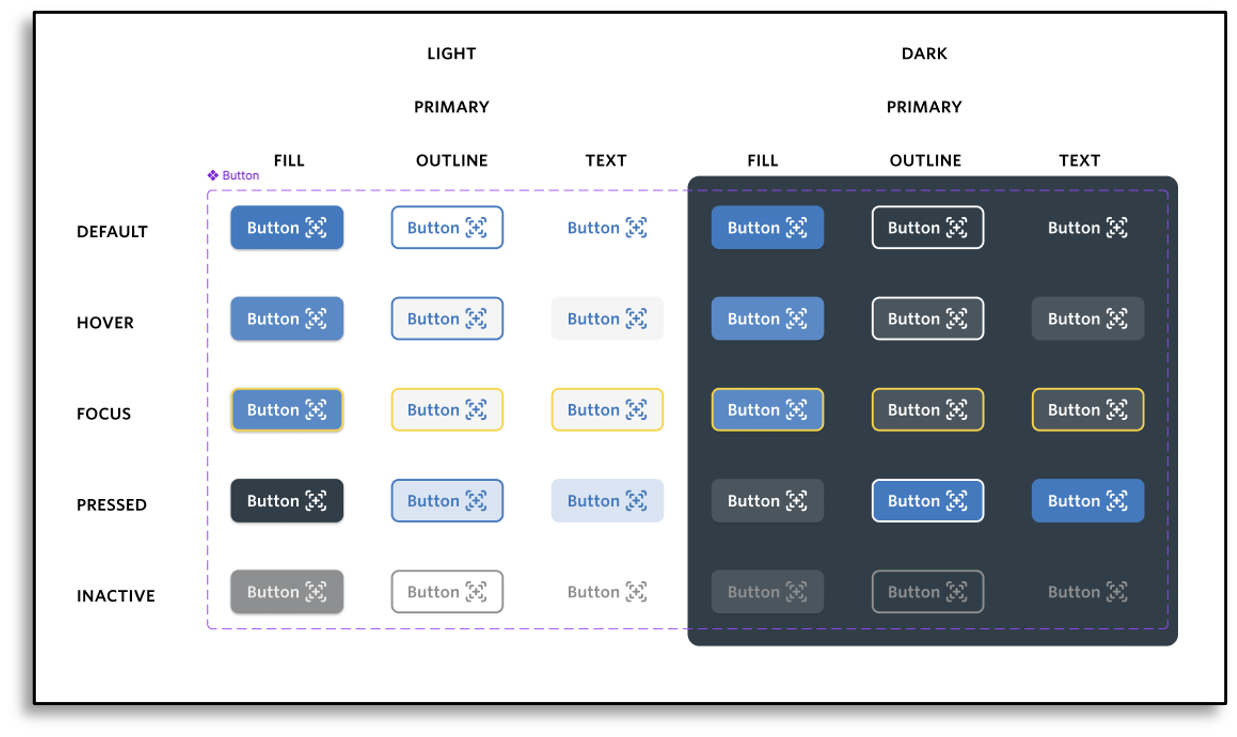
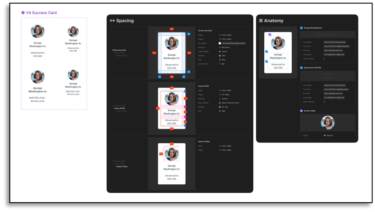
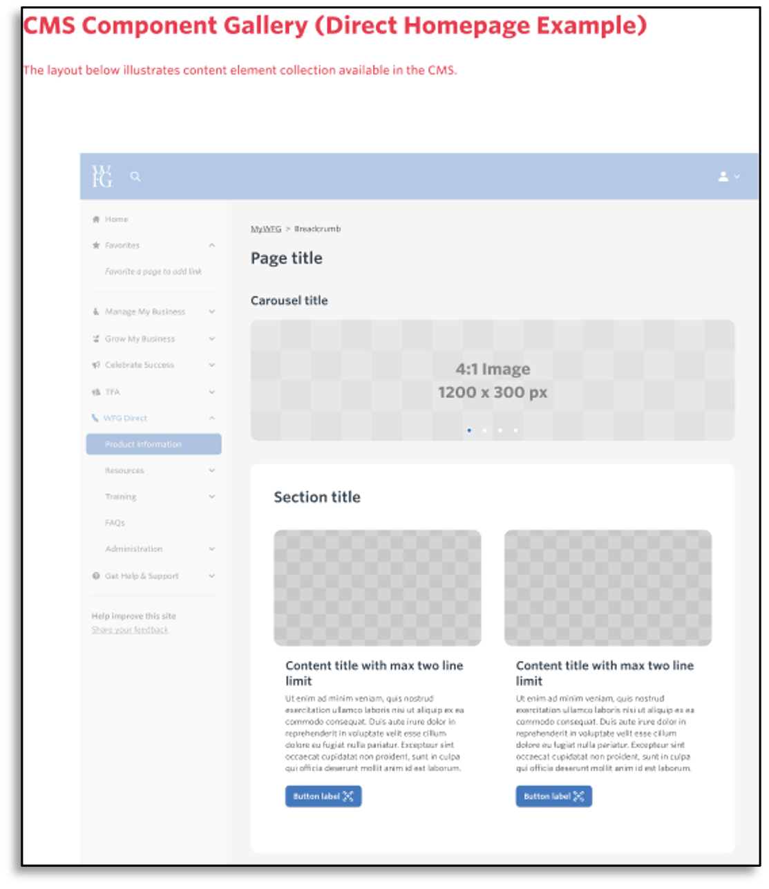
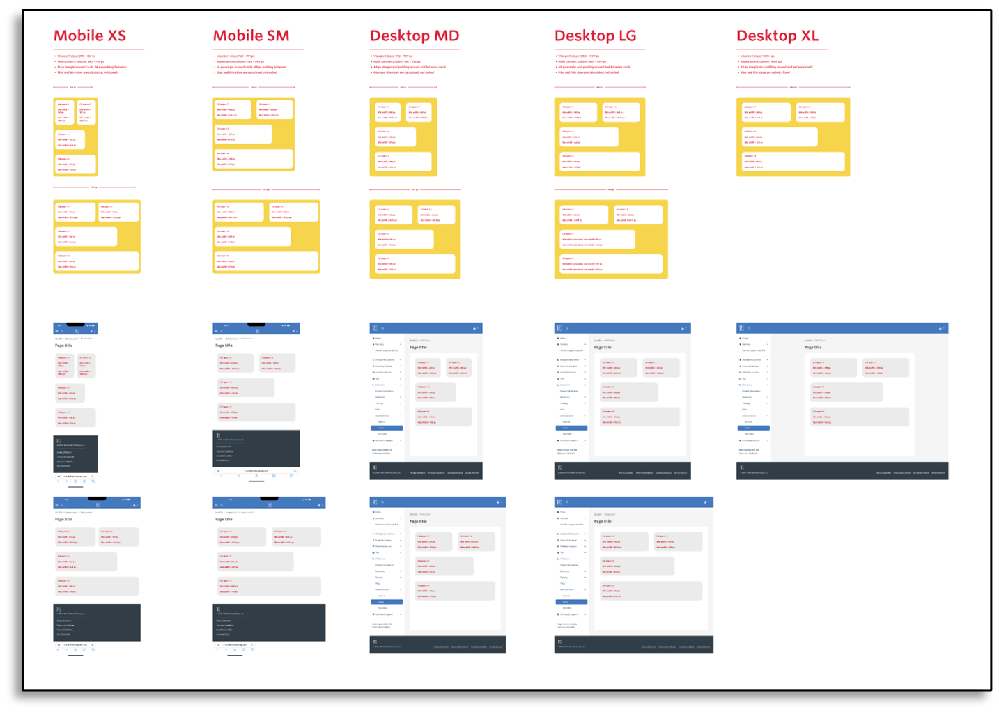
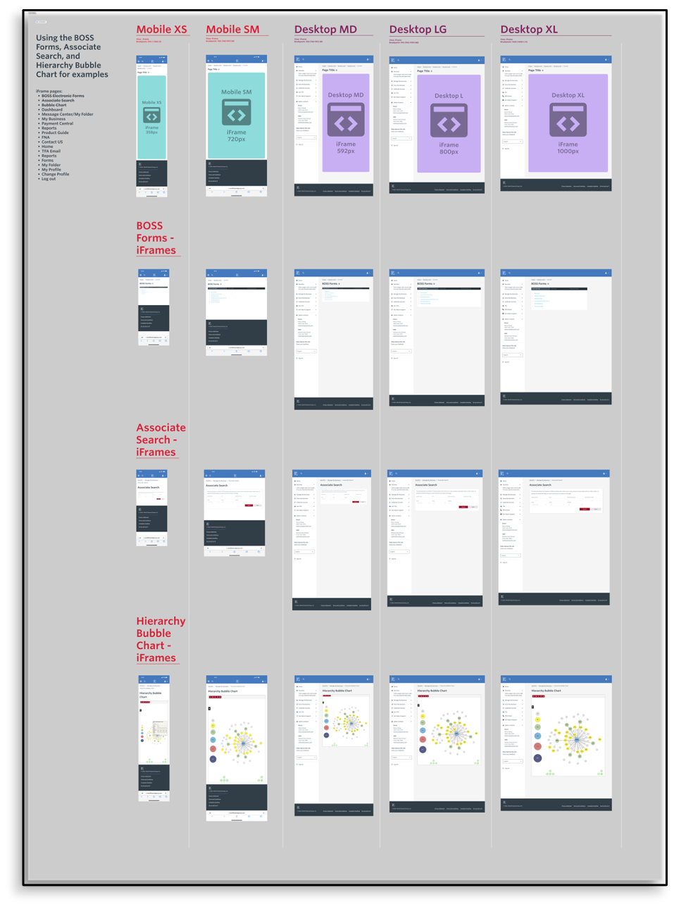
To get the portal moving, we assembled an ad-hoc set of reusable patterns before there was a formal system. The examples below document button behavior on light and dark surfaces, the spacing and anatomy of a success card, a CMS page pattern, and layout guidance across mobile and desktop sizes. They also show how embedded tools such as forms, associate search, and the hierarchy chart could fit within the portal shell.
This was practical design and implementation guidance for the WFG work, not a claim that we had established a fully governed, organization-wide design system.
Patterns the team could build from
These five examples document interaction states, component specifications, CMS composition, and responsive behavior. Open any image to inspect the details at full size.
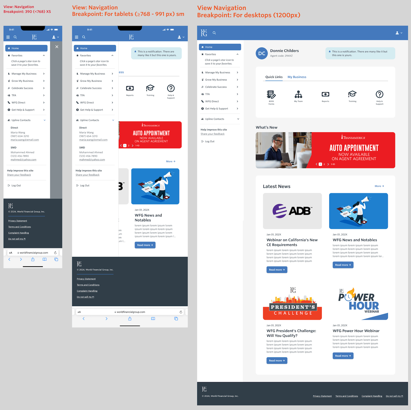
Portal across breakpoints
The responsive home study shows how the same portal shell changes across phone, tablet, and desktop sizes. The navigation stays available on smaller screens while the wider layout has room for profile context, shortcuts, and news. It connects the component work above to a complete page design; the images alone do not show measured usability results.
One portal across screen sizes
The study places phone, tablet, and desktop layouts side by side. Open the image to inspect the navigation and content at full size.
Targets
| Target | Note |
|---|---|
| 95% task completion target | Aspirational goal, not a measured outcome |
| 20% weekly login increase target | Aspirational goal, not a measured outcome |
| 75% satisfaction rate target | Aspirational goal, not a measured outcome |
| 40+ Net Promoter Score target | Aspirational goal, not a measured outcome |
These figures were the success metrics defined at the outset, informed by user research, competitive analysis, and usability testing. They were never measured against a shipped result: this case study reports the targets the team set, not verified outcomes, and does not claim the redesign hit them.
Lessons
- Direct user engagement finds what assumptions miss. Pushing for user interviews and usability testing on a redesign whose direction was already set uncovered pain points the original plan had not accounted for.
- A tailored design system is a usability decision, not just a branding one. WFG's functional requirements did not map cleanly onto an off-the-shelf component set — customization was what made the role-based personalization possible.
- Collaboration on someone else's plan is still real design work. Joining after direction was set does not mean design has nothing to contribute — arguing for research and shaping role-specific features within an existing plan is where this project's value showed up.
FAQ
Did you set the direction for this redesign? No. The decision to redesign the portal was made before I joined the team. What I contributed was pushing for user interviews and usability testing so the design was grounded in real agent pain points, plus the design system and personalized, role-based interface built from that research.
Did the redesign hit its targets? That was never measured and this case study does not claim otherwise. The 95% task-completion, 20% engagement, 75% satisfaction, and NPS 40+ figures were goals set at the outset from research and competitive analysis — aspirational benchmarks, not reported results.